

You publish a new post. Traffic ticks up. People read it.
Then you check your email list. It barely moved. This month’s number looks a lot like last month’s.
If you keep asking why blog visitors don’t sign up for your email list, you’re not alone. New posts bring more traffic, but the list stays flat. That’s a frustrating spot to be in.
Here’s the real cost. Every reader who leaves without signing up is gone for good. You can’t reach them again. You get no second chance when they’re ready to buy.
The traffic you worked for evaporates a little more each day. Visitors who leave without signing up take their attention with them. You paid for that attention with hours of writing.
This post is the solution. It stacks ten signals you can check on your own blog. Your analytics, form stats, copy, layout, and popup settings each hold a clue. No single signal proves anything alone. But when they all point the same way, you’ll see exactly why visitors don’t sign up.
At the end, you’ll also see how the free Reader Journey Leak Audit walks the whole reader journey. It finds breaks like this one.
Checking Every Post, Form, and Popup by Hand Is Slow, and It Still Leaves You Blind
You could do this the manual way. Open every post. Check every form. Test every popup, one at a time.
That’s slow, and it’s easy to get wrong. Even when you finish, you still can’t see the whole journey at once.
That’s why the free Reader Journey Leak Audit exists. It walks the reader’s journey from first click to purchase. It finds the break between traffic and affiliate sales.
Before you try it, start with the ten signals below. They’ll show you the opt-in break first.
No single signal below proves the case. Each one comes from a different place on your blog. Some live in analytics. Others live in your form tool, your copy, or your layout.
Check them one at a time. Write down what you find. Then watch where they all point.
Table of Contents
Signal 1: Your Traffic Climbs. Your List Doesn’t.
Open your analytics. Look at sessions over the last 90 days. Then look at new subscribers over the same stretch.
If sessions are rising and subscribers are flat, that’s your first clue. The traffic is real. It’s just traffic that doesn’t become subscribers.
Here’s how to check it. Put both numbers side by side, month by month. Sessions in one column, new subscribers in the other.
Next, work out your opt-in rate. Divide new subscribers by sessions. That gives you a rough email conversion rate.
If that number sits near zero while traffic is healthy, mark it down. Low email sign-up numbers alone prove nothing yet. But they’re the first line of evidence.
Now zoom in on your single most-read post. Check how many people read it last month. Then check how many subscribers it produced.
Your email tool may show which page each signup came from. Put the two numbers side by side. If your best post sends almost nobody to the list, you’ve learned something useful.
It rules out “the wrong posts are ranking.” Your strongest page is pulling readers in, and almost none of them join.
So this is not a one-post problem. It’s a sitewide pattern. Subscribers aren’t coming in from blog traffic, even where that traffic is strongest. That’s the same flat line from the whole blog, seen up close.
Signal 2: Readers Stay to the End, and Still Leave
Now look at how people read. Check your average time on page. If you track scroll depth, check that too.
If people finish your posts, your content is doing its job. They’re not bouncing in the first ten seconds. They’re reading.
That matters for one reason. Blog readers who never subscribe are not bored readers. They read, they nod, and they leave without signing up.
To check this, pick your top five posts by traffic. Look at time on page for each. Compare it to how many people subscribed from those posts.
Strong reading with weak sign-ups is a pattern. The content is not the break. The step after the content is.
Signal 3: Your Form Gets Seen, and Skipped
Open your form or popup tool. Find the stats for views and submissions. Most tools show both.
Look at the gap. If you see plenty of views and almost no submissions, visitors are skipping your opt-in form. The email capture box is right in front of them. They walk past it.
This rules out one common excuse. It’s easy to think nobody saw the form. The numbers say they did.
To check it, note the view count for each form. Then note the submissions. Do this for every form on your blog, including sidebar boxes and popups.
Views without submissions point to a failure to capture email addresses. People saw the offer and chose not to take it. That’s a clue about the offer itself, and the next signals dig into it.
Signal 4: The Offer Is Just “Updates”
Look at the words on your signup form. Do they say “Subscribe for updates”? Or “Join my newsletter”?
Those lines are vague. Updates about what? How often? Why would a busy reader want them?
A weak value proposition gives people no reason to act. Many readers who don’t opt in were never given a specific reason. They didn’t say no to your list. They never heard a real pitch.
Your subscribe copy is the pitch. A pitch that promises nothing converts nobody. Call-to-action clarity matters here. The reader should know what they get and why it helps.
Here’s the check. Read your form’s headline like a stranger would. Pretend you’ve never seen your blog.
Ask three questions. What will I get? When will it arrive? Is it worth my email address?
If the headline can’t answer those, your readers can’t either. Perceived value starts with those few words.
Signal 5: The Freebie Has Nothing to Do With the Post
Open one of your posts. Now look at the free download offer beside it.
Does the freebie continue what the reader just read? Or does it point somewhere else?
Here’s a made-up example. A post explains how to pack a carry-on for a week. The form offers an “Ultimate Travel Guide.” The reader came for one problem. You offered help with a different one.
That’s an offer-audience mismatch. It breaks the link between your content and your offer. An irrelevant lead magnet also attracts the wrong subscribers.
Now compare a content upgrade. It’s a bonus matched to the post. In the example above, it might be a printable carry-on packing checklist. It continues the exact thing the reader was already doing.
The check takes ten seconds. Does the free download extend this post, or ignore it? That’s lead magnet relevance in one question.
Signal 6: The Form Sits Where Nobody Looks
Where does your only signup form live? For many blogs, it’s the sidebar. Or below the comments. Or in a footer subscribe field.
Readers focus on the article. A sidebar signup form fades into the background. On a phone, it often drops below the post entirely. Few people scroll to the footer.
A buried subscribe button goes unnoticed. Some people who skip the subscribe step never saw it.
Placements that work sit closer to the reading. An inline form inside the post catches readers mid-idea. A header signup bar stays visible at the top. A signup landing page gives you a clean link to share.
Here’s the check. Open one post on your phone. Scroll like a reader would. Count how far you go before any chance to sign up appears.
If it takes several screens, form placement is part of the problem. Readers can’t join what they never see.
Signal 7: The Popup Fires Before the Value
Some popups appear three seconds after the page loads. The reader hasn’t finished a sentence. Not one idea has landed.
A reader who has gotten nothing yet owes you nothing. They see the email popup as an obstacle. They close it and move on. Popup timing turns the ask into a toll booth.
Visitors who won’t subscribe to the newsletter may be reacting to the interruption. They haven’t judged your content or your offer. They’ve judged the timing.
An exit-intent popup is the fairer version. It asks on the way out, after the reader got the value. The ask feels like a follow-up, not a roadblock.
Here’s the check. Open your site in a private window. Start a timer. Note how long it takes before the first ask appears.
If it shows up before a reader could finish a paragraph, the timing works against you.
Signal 8: The Form Asks for Too Much
Count the fields on your sign-up form. Name, email, website, a dropdown, maybe a checkbox or two. That’s the number of form fields a stranger has to get through.
Readers weigh effort against reward. They ask, “Is this worth my time?” Every extra field adds to the effort side.
The reward stays the same. Your freebie doesn’t get better because you asked for a website. So the scale tips toward leaving.
You can check this by counting. Look at every field past the email address. Each one has to earn its place.
Ask what you’d lose without it. If the answer is “not much,” cut it.
Now picture a slide-in box that asks for one thing. An email and a button, nothing else. That’s the low-friction version.
Form friction is quiet. Readers don’t complain about it. They just close the tab.
Signal 9: Nothing Answers the Trust Question
Look at your subscribe button. Now look at the words around it. Does anything say what happens after someone hands over their address?
Readers have questions they rarely say out loud. How often will you write? About what? Can they leave if they don’t like it? Vague promises leave them hesitant.
Trust and privacy concerns show up right at the form. A missing privacy line makes them worse. Most people have been burned by spam before.
Here’s the check. Read only the words within one screen of your subscribe button. Ignore the rest of the page.
Would a cautious stranger feel safe? Do they know the topic, the pace, and how to leave? Do they know you won’t share their address?
A short line can fix a lot. Here’s made-up sample wording: “One email a week about budgeting. Unsubscribe anytime. I never share your address.”
Signal 10: Nothing Has Ever Been Tested
Think about your form since launch day. Same form. Same offer. Same placement. Has anything changed?
A list-building strategy that never changes can’t improve. It produces poor newsletter sign-ups year after year, because nothing was ever compared. You have one result and nothing to measure it against.
Split testing opt-in offers fixes that. You show version A to half your readers and version B to the other half. The one that earns more sign-ups wins. Change one thing at a time: the form, the offer, or the placement.
This is the signal that matters most. It turns the other nine from opinions into measurements. Without a test, “my popup fires too early” is only a guess.
An untested setup guarantees unconverted visitors on the email list side. The setup may not be bad. You just never checked.
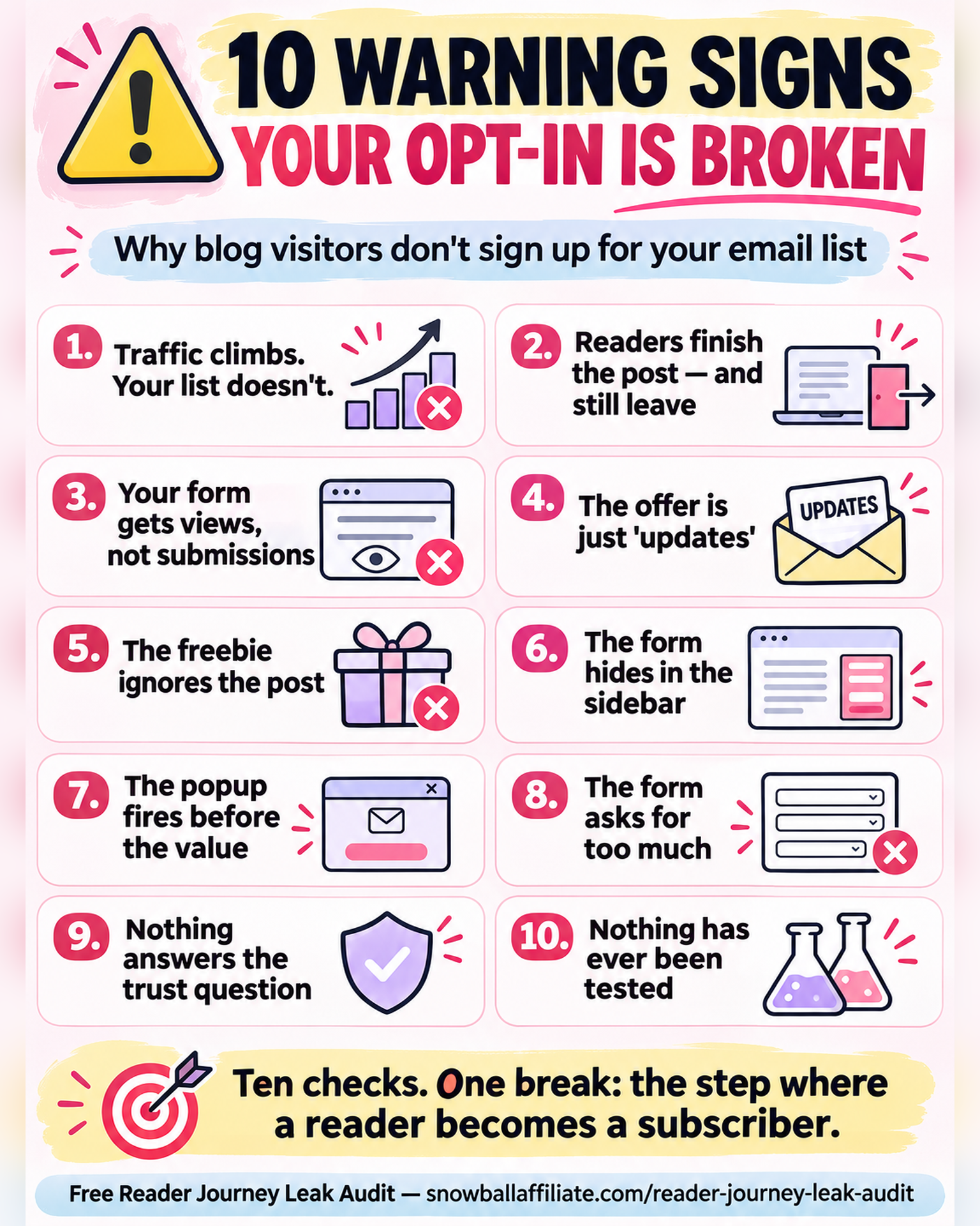
Ten Checks. One Address.
Look at where these ten signals come from. The analytics. The form stats. The copy on the form. The page layout. The popup settings. The field count.
Those places have nothing to do with each other. Different tools, different data, different fixes. They share only where they point.
Traffic is not the break. The content is not the break. Readers show up, and they read.
The break is one step. It’s the moment a reader becomes a subscriber.
Your opt-in rate is your scoreboard. It shows how well your offer fits your audience. If traffic is healthy and signups sit near zero, the offer is failing. The audience isn’t.
A clear call to action makes the next step obvious. Readers should never guess what happens when they click. Tell them what they get and when it arrives.
A content upgrade gives readers a specific reason to opt in. It’s matched to the post, so it continues what they were already reading. That’s why it works where a generic freebie falls flat.
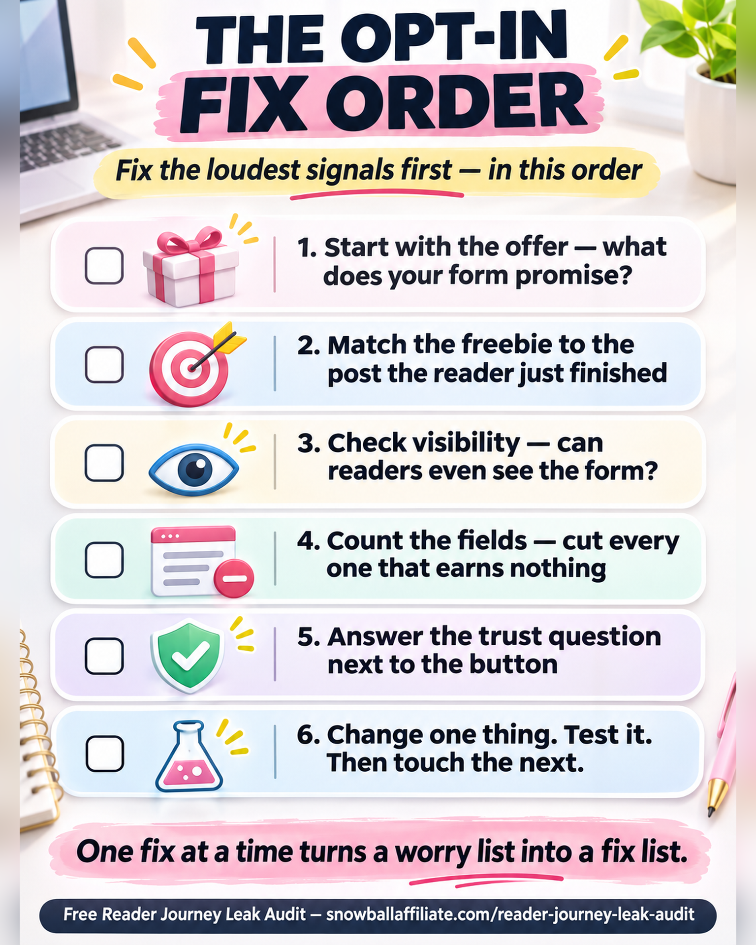
Don’t try to fix all ten signals at once. That turns this list into a worry list.
Look at your own blog instead. Some signals will be loud. Others will barely show up. Start with the loud ones.
For most blogs, the order runs like this. Start with the offer. Check what your form promises. Then check whether the freebie matches the post the reader just finished.
Next, look at visibility. Ask whether readers ever get a fair chance to sign up. A form nobody sees can’t do its job.
Then move to friction and trust. Count the fields in your form. Read the words near the button.
Change one thing. Give it time, then test the result before you touch the next. That’s how the stack becomes a fix list instead of a worry list.
Now you know how to check each signal on your own blog. Run them one at a time and watch them converge. The resources below make that easier.
Products / Tools / Resources
Everything listed here is free.
- Your analytics (whatever you already use): Compare sessions against new subscribers for Signal 1.
- Your email platform’s form and popup stats: Compare views against submissions for Signal 3.
- A simple doc or spreadsheet: Log the ten checks, one row per signal. That way you can see the whole stack at once.
- The free Reader Journey Leak Audit: It walks the whole reader journey from first click to purchase. It finds the break between your traffic and your affiliate sales, this opt-in step included.