
You’ve done the work. The “best X for Y” guide is live, it’s ranking, and the traffic is real — people are actually finding it. But something’s off. They land, they scroll, maybe they even read the whole thing… and then they leave. No click. No cart. No commission. You refresh your dashboard and the numbers just sit there, flat, no matter how many more of these posts you publish.
Here’s what’s actually happening: your buying guides read like inventory lists, not like something built to help a person choose. In this post, we’re going to sit with that difference for a while — what separates a list from a real decision tool, the quiet habits that keep dragging your guides back into list-mode, and a framework you can actually use to rebuild them so they start doing their job. No product rankings here, no reviews. Just the structural stuff that makes the difference between a guide someone reads and a guide someone acts on.
A guide can rank fine and still lose the sale if it never actually helps someone decide. The free Reader Journey Leak Audit helps you find the one break between your traffic and your affiliate sales. Grab it below and see where your guide is losing the reader.
Table of Contents
A List Tells Them What Exists. A Decision Tool Tells Them What to Choose.
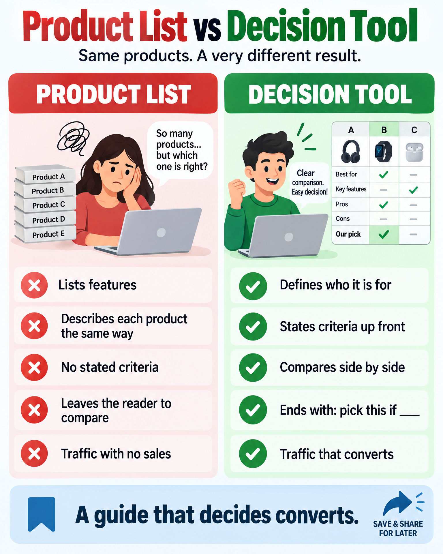
Think about what a product list actually does. It says: here are ten things that exist in this category. It describes each one, maybe throws in a few adjectives, and then it stops. The reader walks away knowing more options exist than they did five minutes ago. That’s the whole transaction.
A decision tool asks more of itself. It takes someone who’s standing at a fork in the road, genuinely unsure which way to go, and it walks them there. It says: here’s how people in your exact situation should be thinking about this, here’s what actually separates a good pick from a wasted one, and here — here’s the one that fits you.
That gap, the space between “here’s what exists” and “here’s what to pick” — that’s where your commissions are disappearing. Search engines love the list format because it answers the query cleanly. But readers didn’t come here for a clean answer to a query. They came because they’re stuck, and stuck people need a decision tool, not a menu.
If you want to go deeper on why ranking well and converting well are two entirely separate battles, Why Product Reviews Don’t Convert Even When They Rank walks through the review-side version of this exact problem. What’s happening in buying guides is really just its close cousin, wearing a different outfit.
The Feature-Dump Habit (You Know the One)
Most buying guides fall into the same rhythm without anyone deciding to write them that way. Pick a product. List its specs. Write a tidy paragraph about what it does. Move on to the next one. Repeat that five, six, ten times. Bolt on a comparison table with a wall of checkmarks. Hit publish.
It’s fast. It fills the word count. And it is, frankly, almost useless to someone trying to make an actual decision — because features without context are just noise dressed up as information.
Take a sentence like “supports up to 10,000 subscribers” or “includes drag-and-drop editing.” Neither one tells the reader anything about whether it matters to them, specifically, today. A feature is a fact about the product sitting there in isolation. A decision-relevant sentence takes that same fact and tethers it to a real person’s real situation. That tether is the entire difference — and it’s the part most guides skip, because writing the tether requires you to actually decide who’s reading before you write a single word.
Signs You’re Feature-Dumping (Even If It Doesn’t Feel Like It)
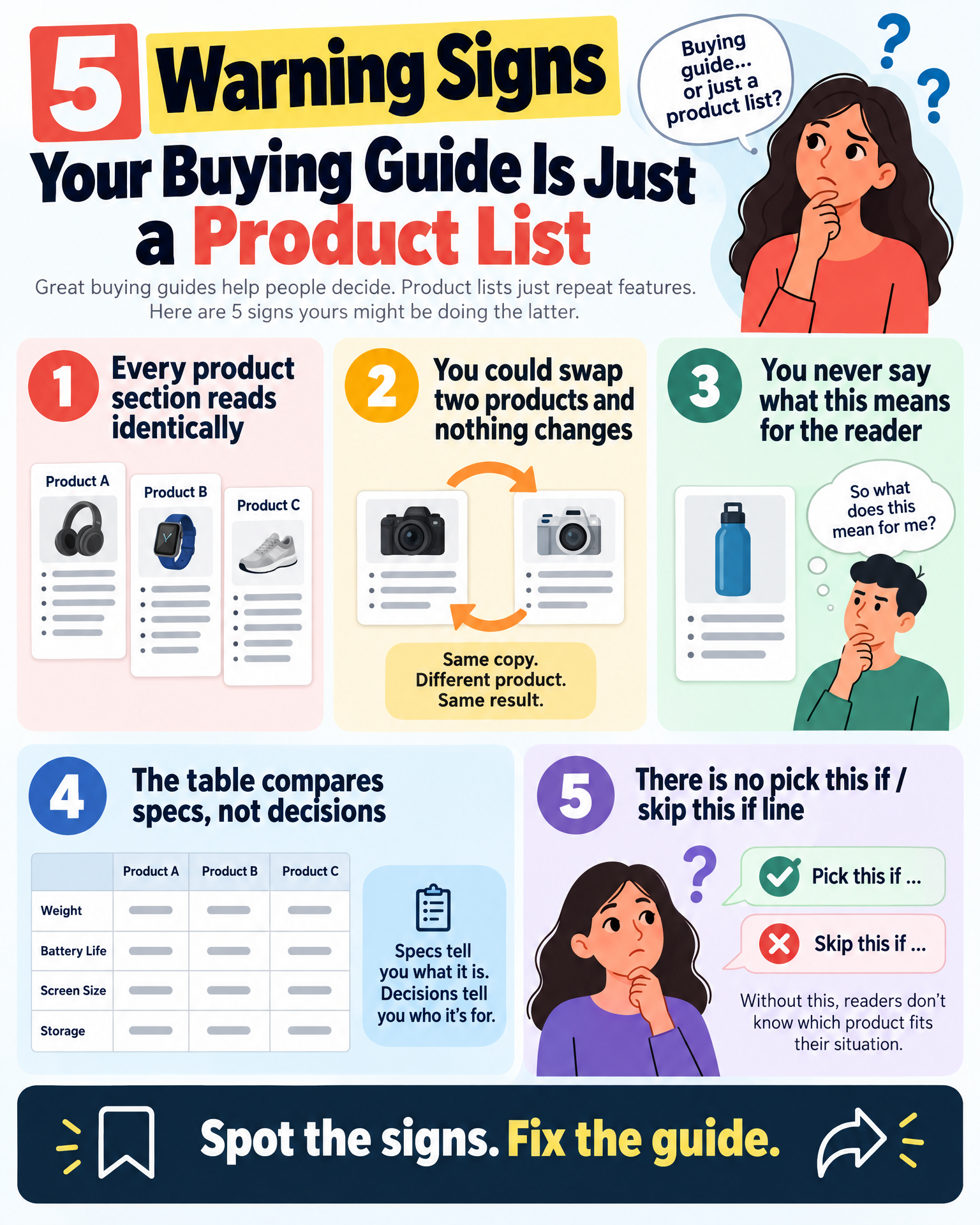
- Every product section follows the exact same shape and length, like they came off an assembly line
- You could swap two sections around and nothing would feel out of place
- The word “features” — or a bullet list of specs — is doing most of the actual work
- You never once write “this matters because” or “what this means is” anywhere in the post
- Your comparison table has more spec columns than use-case columns
The Ghost in Your Guide: Nobody Knows Who’s Reading It
Here’s the question almost nobody sits with long enough: who, exactly, is this guide for? Not “people who want an email tool” — that’s not a person, that’s a category. Who is actually sitting there at 11pm, phone glowing in the dark, trying to solve a problem they can’t quite name yet?
If you can’t answer that, you can’t tell anyone what actually matters — because what matters shifts entirely depending on who’s asking. A solo creator sending one newsletter a month is not the same person as someone running an online store with five automated sequences quietly firing in the background. Write one generic “best X” post aimed at both of them, and you end up helping neither. It’s not that the content is wrong. It’s that it’s aimed at no one, so it lands on no one.
This is also why so many technically accurate guides still feel hollow when you read them back. Nothing’s factually off. It’s just… talking into the void. Before you write a single product description, sit with these:
- What specific situation dragged this person to the search bar in the first place?
- What do they already know, and where exactly does the fog start?
- What’s the wrong choice they’re most likely to make if nobody stops them?
- What does getting this right actually give them?
Answer those honestly, and the rest of the guide practically writes itself — because now you’ve got a filter. You know what to keep and what to cut.
The Criteria Nobody Bothers to State
A real decision tool tells you the rules before it shows you the players. Before a single product gets mentioned, it says: here are the three or four things that actually separate a smart choice from a regretted one in this category, for someone standing exactly where you’re standing.
Most buying guides skip this part entirely. They jump straight into product one, product two, product three — with no explanation for why these particular options made the cut, or which dimensions even matter here.
Without stated criteria, the reader is holding forty scattered features with no scale to weigh them on. So they do what anyone would do when they’re overwhelmed — they pick randomly, or they pick whatever was listed first, or they give up and go find a different post that actually makes the decision feel possible.
Stating your criteria upfront does something quietly powerful. It gives search engines and AI summarizers a clean structure to pull from — which helps with snippets and with how your content gets surfaced in AI-generated answers. And it tells the reader, almost immediately, that you’ve already done the hard thinking on their behalf. That’s the entire reason a buying guide exists in the first place.
Finding Criteria That Actually Mean Something
- Write down every factor you’re tempted to mention — price, ease of use, support, integrations, whatever’s floating around in your head
- Cross out anything that’s basically true of every option in the category — if it doesn’t differentiate, it doesn’t belong here
- Keep the three to five factors where the products genuinely, meaningfully diverge
- For each one, write a single honest sentence explaining why your reader — the specific one you defined earlier — should care
That short list becomes the spine the rest of your guide hangs on.
Where the Comparison Should Be, and Usually Isn’t
Even guides that manage to state decent criteria often stop short of the thing that actually matters: putting the products next to each other and comparing them. Instead, they describe each one in its own little bubble, one after another, and quietly hand the reader the job of holding five different feature sets in their head and doing the math themselves.
That’s a heavy lift for someone who was already overwhelmed enough to type “best X” into a search bar instead of just picking something and moving on with their day.
A real comparison lines the products up against the criteria you already established and says something plainly about how they differ. Not “Product A has feature X” buried in one paragraph and “Product B has feature Y” buried three paragraphs later — but something more like: both of these handle the core problem, but they get there differently, and here’s exactly who each approach actually suits.
This is also, quietly, where a lot of guides go soft. A real comparison sometimes forces you to say one option is simply better for most people — and that can feel like it undersells the others, so writers dodge it. But that dodge is exactly what leaves the reader stranded. If you want to see this played out in full, the Snowball Affiliate vs Blog Growth Engine: Which Blogging System Should You Choose? comparison was built specifically to get someone to a decision, not just to describe two systems side by side and shrug.
This same gap shows up again in Why People Click Your Affiliate Links but Still Don’t Buy — readers click because your post sparked curiosity, then they land on a sales page with nothing to measure it against, and they bounce right back out. The comparison was supposed to happen before the click. Not after. For a course-level example, Snowball Affiliate vs Making Sense of Affiliate Marketing: Which Problem Are You Actually Trying to Solve? lines two monetization courses up against the problem each one actually solves.
Rebuilding It, Start to Finish
Here’s the practical version — the order to actually do the work in, which isn’t always the order things end up appearing on the page.
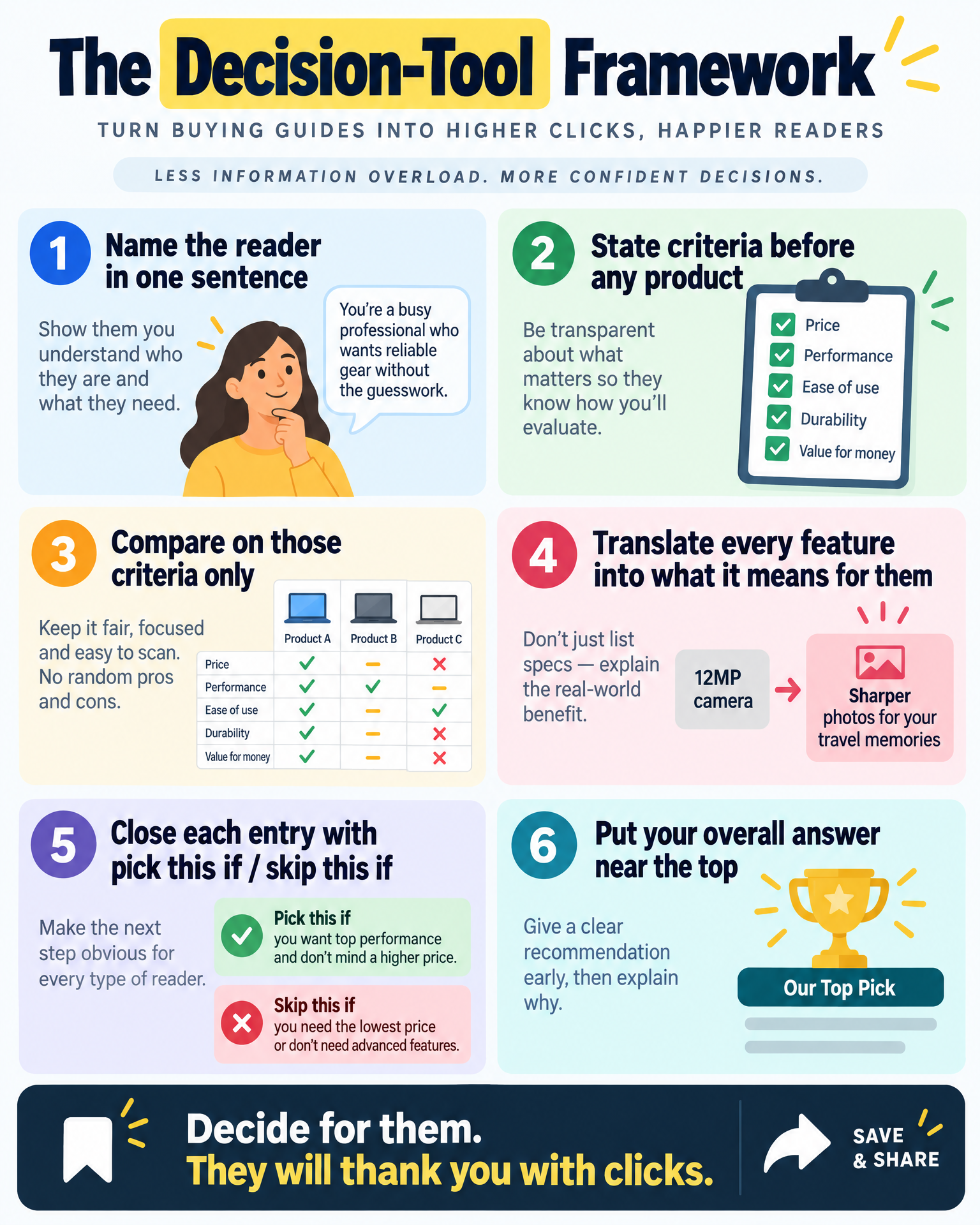
1. Name the reader — one sentence, no hedging
Write it down, literally: “This guide is for [specific person] trying to [specific outcome], who’s usually stuck on [specific thing].” If you can’t fill that sentence in honestly, you’re not ready to write the guide yet. Sit with it a little longer.
2. Lay out your decision criteria before a single product shows up
Tell the reader, right up front, what actually separates good choices from bad ones in this category — for someone exactly like them. Three to five criteria, each with a short line explaining why it matters.
3. Compare against those criteria — nothing else
Build your table or your comparison section around what you’ve already established, not around every spec sheet you managed to dig up. If a feature doesn’t map back to one of your criteria, it probably doesn’t belong in there at all.
4. Turn every feature into a “here’s what this actually means for you”
This single move is the highest-leverage rewrite you can make to an old guide. Every time you state a feature, follow it immediately with what that feature changes about the reader’s actual day-to-day life.
5. Close every entry with a conditional — not a compliment
“This is great” is a list sentence, and it tells the reader nothing. Try: “pick this if ___, skip it if ___.” That conditional language is what quietly turns a description into something someone can actually use.
6. Put your overall answer near the top, not buried in paragraph six
If you have an overall pick — or a split like “best for beginners” and “best for power users” — say so early, then spend the rest of the post backing it up. Readers reward this. So, increasingly, do AI summarizers.
Before and After: The Same Facts, Two Completely Different Outcomes
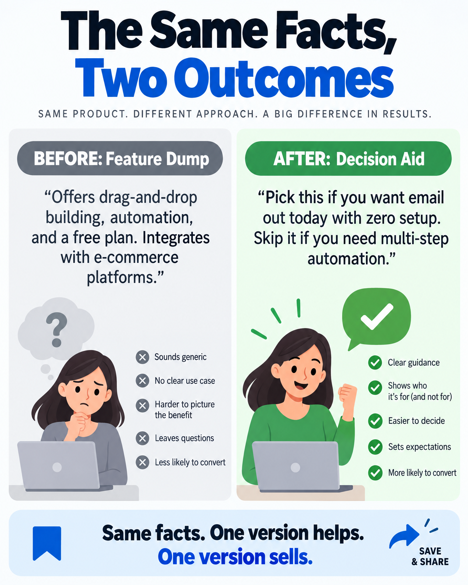
Here’s what a feature-dump entry looks like, using a fictional category — beginner email tools:
Before: “This tool offers drag-and-drop email building, automation workflows, and a free plan for up to 500 subscribers. It integrates with several e-commerce platforms and includes basic analytics.”
Every word of that is probably true. It’s also completely interchangeable with a dozen competitors in the same space, and it tells the reader nothing about whether it’s right for them. Now here’s the same information, rebuilt around an actual decision:
After: “If you’re sending your first few newsletters and you don’t want to touch a line of code, the drag-and-drop builder means you can have an email out the door the same day you sign up — no waiting on a designer, no learning curve eating your afternoon. The free tier will likely cover you for months, so you’re not spending money before your list is even worth emailing.
Where it starts to show its limits: if you’re planning anything beyond a simple welcome sequence, the automation tools here are basic enough that you’ll probably outgrow them within a year. Pick this if you want to start emailing today with zero setup friction. Skip it if you already know multi-step automation is coming — you’ll save yourself a painful migration down the road.”
Same underlying facts, both versions. Wildly different amount of actual help. The second one tells the reader what to do with what they just read — and that’s the whole reason a buying guide exists.
What’s Probably Still Nagging at You
Why does my guide rank and still not sell anything?
Ranking is about matching what someone typed into a search bar and covering it thoroughly — a feature-dump list can do that fine. Converting is about actually dissolving the reader’s uncertainty over which option to pick. Those are two different jobs, and a lot of guides only ever show up for one of them. This connects directly to the traffic-without-sales pattern covered in Why Your Affiliate Blog Gets Traffic but No Sales.
Do I really need a comparison table, every single time?
Not strictly — a table is just one vehicle for it. What actually matters is that the reader sees the products measured against the same yardstick, instead of described in separate little silos with no relationship to each other.
How many products is too many for one guide?
Probably fewer than you think. Three to five options, covered with real depth and honest comparisons and clear “pick this if” logic, will do more for a reader than twelve options skimmed at the surface ever could.
Do I have to pick an overall “best” every time?
If your research genuinely points to one clear best-for-most-people option, say it, and say it early. If the category honestly splits by use case — best for beginners, best for high-volume senders, whatever the split is — say that instead. Just don’t make the reader do the splitting themselves. That’s your job.
Can I fix an old feature-dump guide, or do I need to start over?
Usually you can fix it. You rarely need new products or new research — you need a reader definition, stated criteria, and a rewrite of each entry’s closing lines into something conditional. That’s a structural repair, not a full teardown.
Products / Tools / Resources
If you’re going back into your guides to rebuild them, a handful of tools tend to make the process a lot less painful — nothing ranked here, just what’s actually useful to have on hand.
- A simple survey or comment prompt — ask people who almost didn’t buy what nearly stopped them. This is usually the fastest, most honest way to find your real decision criteria instead of guessing at them from your desk.
- A spreadsheet or lightweight database — keep your defined criteria per category in one place, so every guide you write in that niche stays consistent instead of reinventing itself every time you sit down to write.
- A note doc for reader personas — even a single page with your one-sentence reader definition keeps you anchored, so you don’t drift back into generic writing three paragraphs in.
- Screen recording or screenshot tools — sometimes showing a feature in action does more than explaining it ever could, especially when the use case is specific.
- An editorial checklist you actually use — reader defined, criteria stated, real comparisons made, conditional picks written. Five minutes before you hit publish, and it catches most of what this whole post was about.